My Marker Girl Makeover – Dining Room
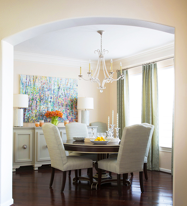
It is our second month of “My Marker Girl Makeover Series”. Where I am sharing with you my own home makeover. Room two is about my Dining Room makeover. I love a more formal area for the Dining Room along with my everyday Breakfast area. I call it the grown-ups table. This is for when we have family gatherings – we use it for the grown-ups, no kids allowed. It is such a fresh room you get to see when you first walk into my home.
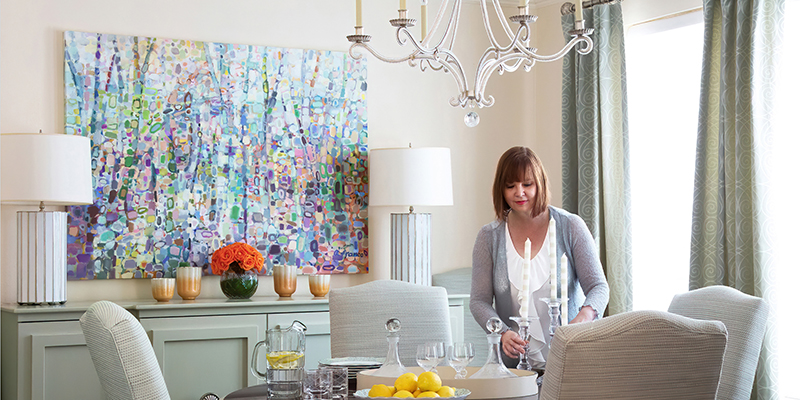
With this room I went neutral with the colors a soft muted green and cream walls (Benjamin Moore Durango Dust 2165-60). This is so that I can decorate with different colors year round. It changes with different holidays and even party themes. Consider a more neutral dining room if you are like me and like to decorate year round for holidays.
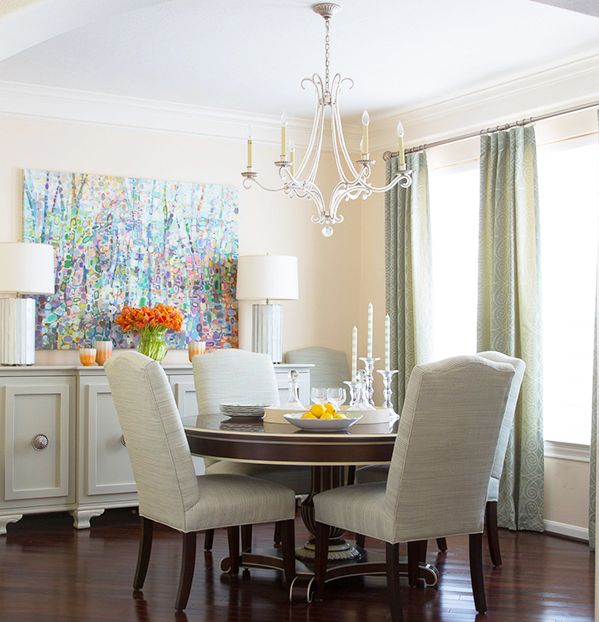
I love the table a great investment from Hickory Chair their Gustav Table that extends into a large oval to seat more people. I had them add cream striping to highlight the details in the table. It works with this very odd shape dining room. It is angled on one end cutting the back wall almost in half. The chairs are from Fairfield Chairs, I kept them simple in shape and style. I used a Kravet fabric for the drapery, that has a playful scroll pattern.
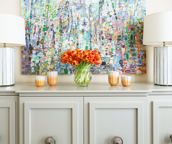
I opted for custom cabinets that fit the space they are painted in (Sherwin Williams Jogging Path 7638) with chunky modern doors and I used drapery holdbacks from Robert Allen as hardware for the doors. The artwork is a fun canvas I discovered on Green Box Art. I love all of the colors in it, so I can decorate year round bringing in different colors from the painting. The lamps are from World’s Away and the chandelier from Circa Lighting.
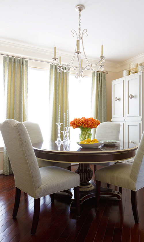
My husband wanted a bar cabinet as well. We were able to have one built to fit the smaller width wall on the opposite side of the room where wall is angled.
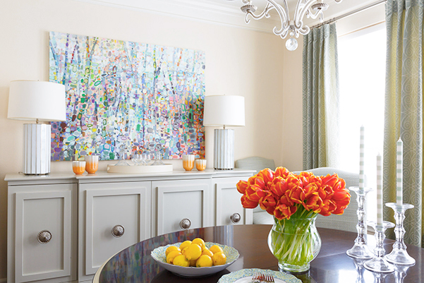
I had to show off my candlesticks from a UK company called Suzy Watson and our paris flea market wine decanters we found when we lived there.
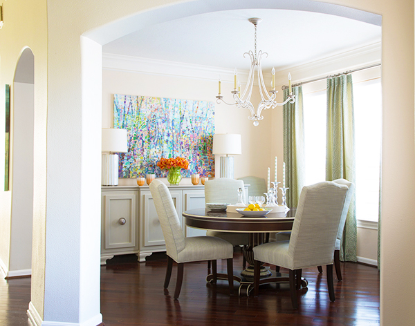
This room puts a smile on my face every time I walk in through the front door. Stayed tuned – next month is all about the Breakfast Room. The room that was made for the kids.
Happy Everything! Karen
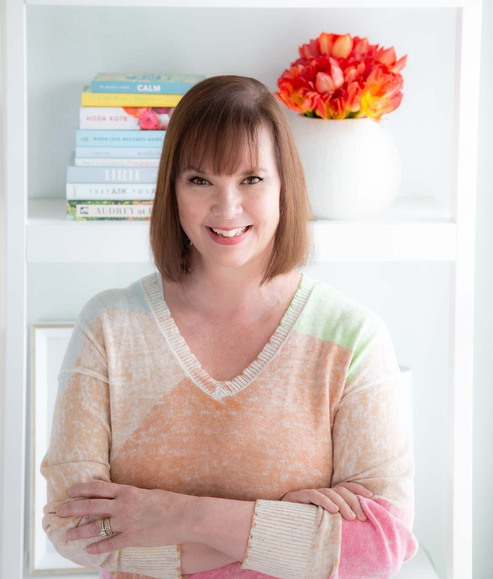
Meet Karen Davis
Marker Girl was inspired by an unforgettable moment with my daughter, a marker, and our furniture. That experience sparked my mission to find stylish, family-friendly furnishings and help others create spaces where life thrives without compromise.
My blog shares the very best of what I have learned about family-friendly design these past 20 years.
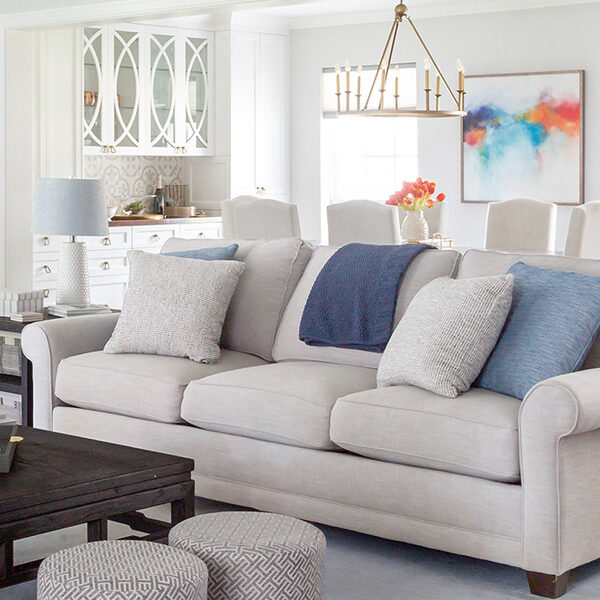
Our Interior Design Services cater to your family’s lifestyle.

Get Our Latest Interior Design News In Your Inbox
Save yourself some time and effort, opt-in to my email list. You will receive recaps of the latest tips and advice about designing a family home every month!

