My Marker Girl Makeover – Powder Room
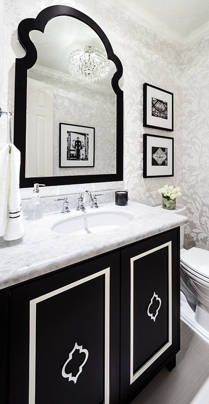
So excited to launch our new series “My Marker Girl Makeover”! I am working on redoing my own home and now it is time to share it with you the first room finished this month’s feature, my Powder Bathroom.
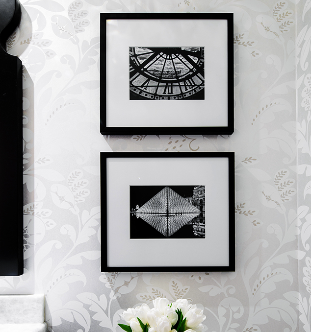
I am so happy with the way it turned out! A fun way to highlight memories my husband and I have of Paris. I place we lived when we were first married.
This room was really hard to photograph. We actually had to get a special lens to show the entire space from top to bottom. I so wish you could see it in person, we have had so many compliments from those who have seen it!
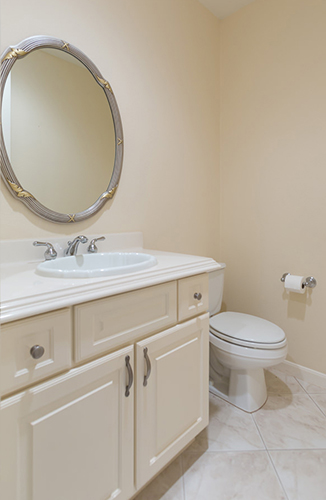
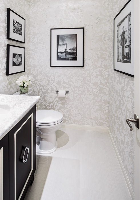
The challenge with this space is its size, a 5 x 6ft space, and the fact there is no daylight entering it. Here was the before. Quite a difference I think!
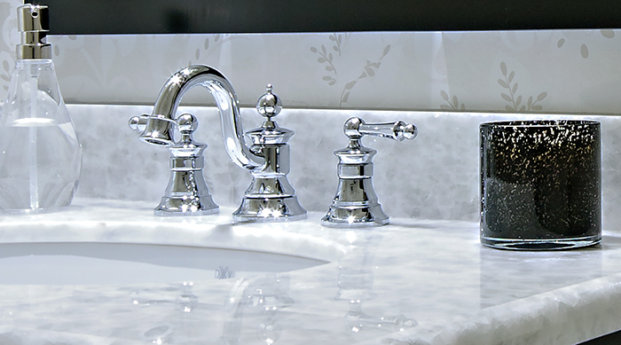
Last summer some of you voted on what faucet should go with my Powder Bathroom concept. The idea was featured in Traditional Home and sponsored by Moen. The winning faucet was the Waterhill a really great choice!
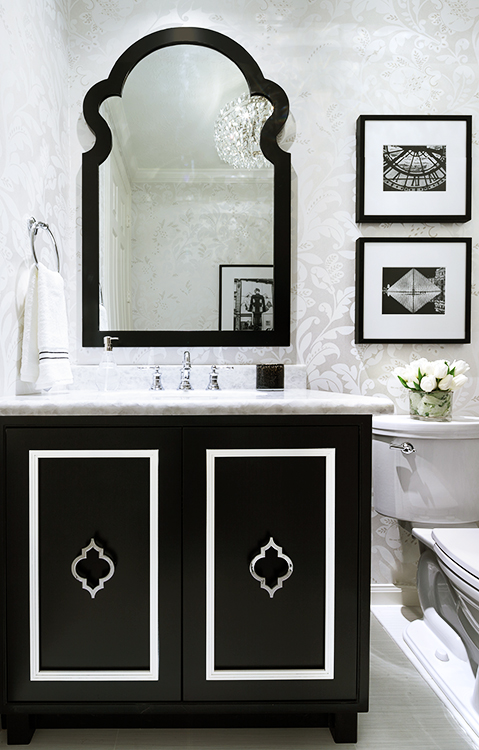
Since my Master Bathroom was not within my budget for this year, I opted to do the Powder Bathroom, one that almost all of my guests and family sees. My idea was to feature my favorite photos that my husband took when we lived in Paris 18 years ago. I designed it in a black and white color scheme to highlight the photos.
Here are more details about the design…
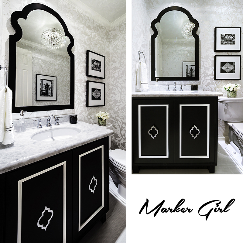
I started first by choosing wallpaper, one that didn’t overpower the photos but instead showed them off. I chose a gorgeous one from Thibaut (Anna French collection) called Livorette Pearl. It’s mostly white, a damask pattern that has a metallic sheen to it, which really shimmers with the lighting.
Lighting was chosen next, a fixture from Circa Lighting called Trillion Light. It reminded me of a set of crystal dessert bowl’s I found at a flea market on a side street in Paris.
Then came the flooring, I went with a strie white and grey porcelain tile from Daltile (Fabrique – Blanc Linen) for its durability. With such a small space I wanted very little pattern on the floor.
For the counter I chose a quartzite called Crystal Ice. It has the feel of marble but is more durable.
I opted to design a custom cabinet that was a very dramatic contrast and felt like a piece of furniture. It was made by my custom cabinet builder Paul Bjork. Painted in Black (Sherwin William Tricorn Black) with off-white stripe accents. I found hardware on Mod Shop to add a little touch of polished silver to compliment the faucet.
Then, the final touch, a mirror I found out shopping one day a local store. It is by Chelsea House – Jagger Mirror. I love the art deco shape of it. It’s a perfect match to my cabinet and the deco shape ties in the theme.
Check out my pinboard for all the details!
Happy Everything! Karen

Meet Karen Davis
Marker Girl was inspired by an unforgettable moment with my daughter, a marker, and our furniture. That experience sparked my mission to find stylish, family-friendly furnishings and help others create spaces where life thrives without compromise.
My blog shares the very best of what I have learned about family-friendly design these past 20 years.
Our Interior Design Services cater to your family’s lifestyle.

Get Our Latest Interior Design News In Your Inbox
Save yourself some time and effort, opt-in to my email list. You will receive recaps of the latest tips and advice about designing a family home every month!

