Styling Wall Shelves in 5 Easy Steps
Before you read my 5 steps to styling a bookcase or wall shelves. I want to be clear this is where you are telling your story. Call it a bookcase story – mixing personal with decorative is the key. There isn’t really a right or wrong way to what you put in the bookcase, it is just creating a simple way to style it so you can then personalize it.
My 5 easy steps to styling wall shelves or bookcases…
The easiest way to really start is by finding a photo of a bookcase you like styled as a guide. Use websites like Pinterest to save pictures to help you find a style you like. Take note of the number of items on the shelves and their varying heights.
STEP 1 – You begin the process by removing all items from the shelves. Then decide how much or little you really want to have on each shelf. The choice is yours if you want more or less. Use large objects if you are wanting less, especially on top shelves that have a more open space. Then start with the personal touch deciding what you want to be featured on each shelf – photos, favorite books, or something you found on your travels you want to showcase. Try to repeat that on 2 or 3 shelves.
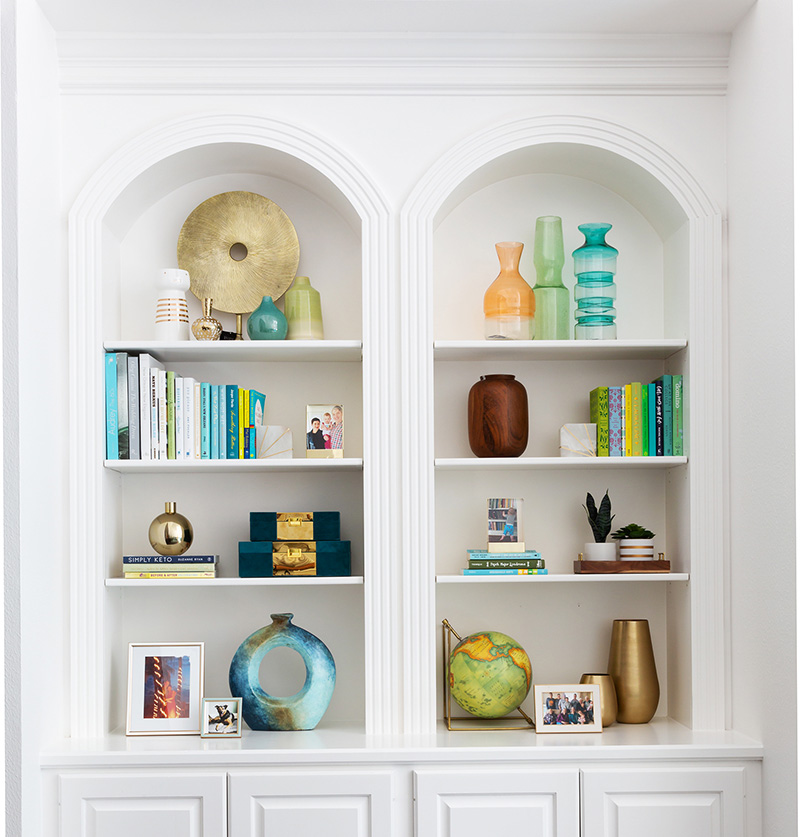
STEP 2 – When you have a larger number of bookcase sections – start with the center. To me, it is the main focal point of the bookshelves. These are the items that you see first, and then your eye moves out with the flow of the layout. If you have adjustable shelves removing one shelf in the middle can really create a great focal point with a larger piece like artwork. Then view it from different angles as well to see if you like the placement.
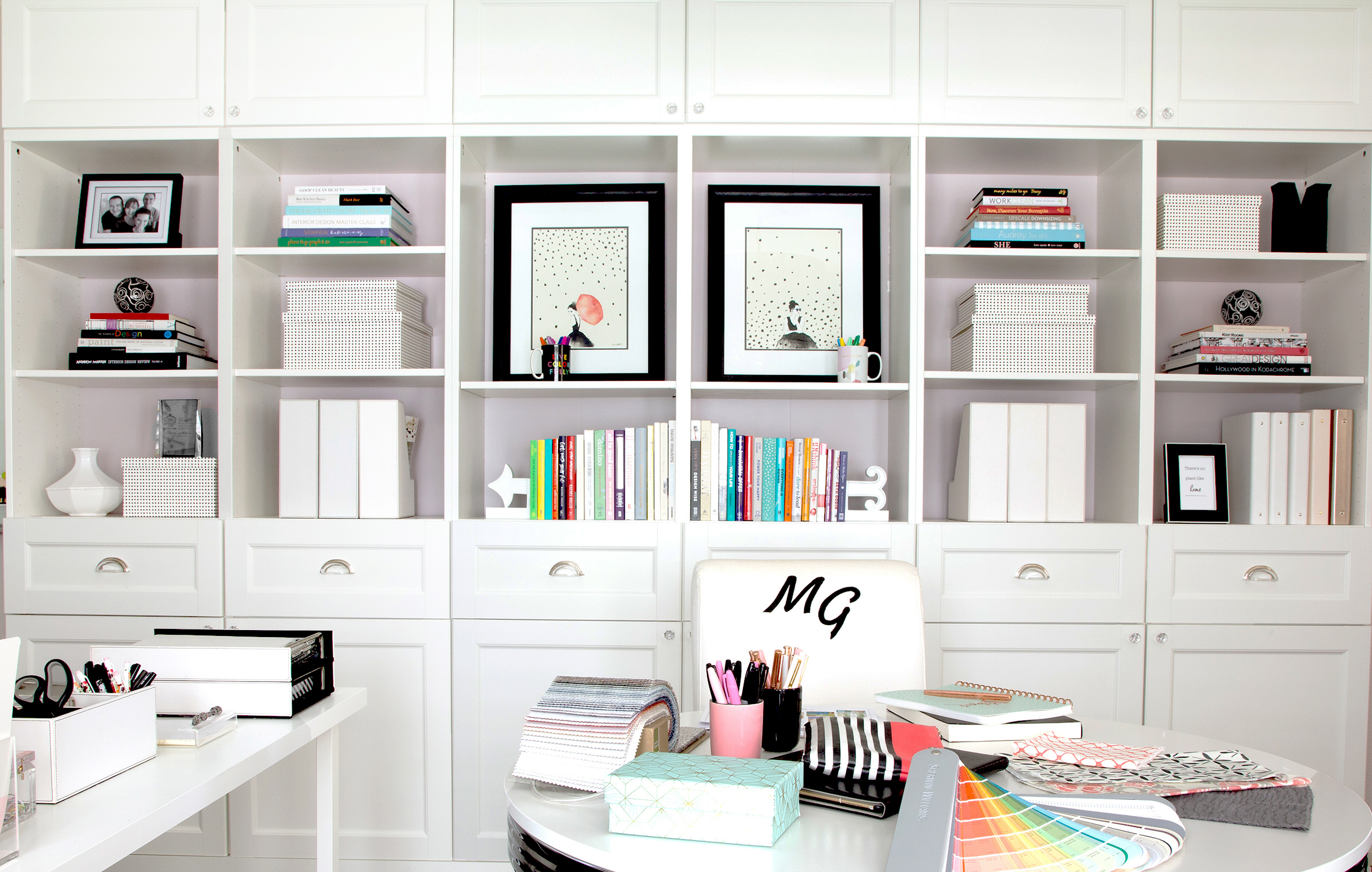
STEP 3 – Once you have a basic layout take the color from furnishings in the room to add in accessories to pull the color palette together. Don’t forget to place them at least two to three times on other shelves. If you are working with a TV unit that has two sides, color repetition can really make a great statement. Step back again to see if you have a good balance. If you are struggling to find colorful decorative items, books are the way to go and add fun prints / small-sized artwork as I have done here.
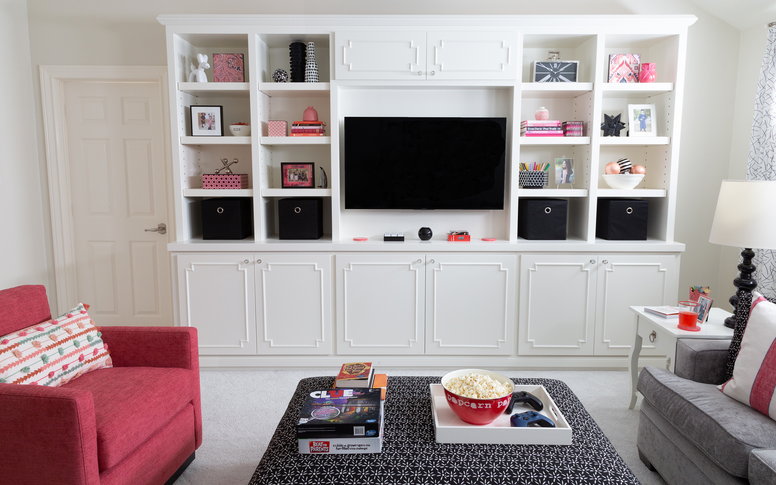
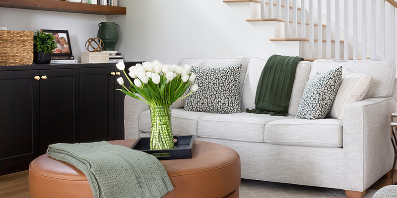
STEP 4 – Now check heights and balance. Note how I have it here… the books are on certain shelves, then glazed pottery on others, and frames are different heights throughout. It creates an overall unified look. They are spaced well apart, you can see a repetition forming.
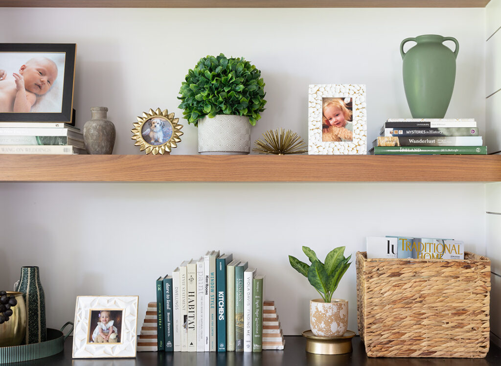
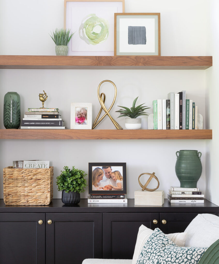
STEP 5 – Walk to the farthest spot in the room this time, look at the bookshelves and see if anything looks out of place or not right. My tip is to move around the pieces on certain shelves if it isn’t feeling quite right. Sometimes it is just a matter of switching items on shelves.
Meet Karen Davis
Marker Girl was inspired by an unforgettable moment with my daughter, a marker, and our furniture. That experience sparked my mission to find stylish, family-friendly furnishings and help others create spaces where life thrives without compromise.
My blog shares the very best of what I have learned about family-friendly design these past 20 years.
Our Interior Design Services cater to your family’s lifestyle.

Get Our Latest Interior Design News In Your Inbox
Save yourself some time and effort, opt-in to my email list. You will receive recaps of the latest tips and advice about designing a family home every month!

