How To Create A Color Scheme
Help! I am struggling with how to pull a color scheme together for my space. I get asked this question a lot. So I thought today I would explain a simple method that is used and taught about how to pull a color scheme together.
THE 60 – 30 -10 RULE
This rule is a great way to achieve a balance with color. It is only to be used as a guide and not so literally, so do not overthink it. I find that when I explain this method to clients, it helps with their overall design, especially with accessorizing.
The first portion of the formula is that 60% of the room’s color is used for the main color. Some experts say to make it the wall color but I see it as the main color you want to feature, so for example if you really love blue go with it for your sofa, bedding, etc. or paint it. Keep repeating it with other furnishings. You would want to paint your room another color that is more neutral if you not going to make it the main color. This isn’t an exact science, so just make sure it is shown in a focal point and repeated in the room in at least three different ways: furniture, drapery, rugs, accessories, and so forth. The 30% is your secondary color and can be shown more within the patterns and accessories in the room, and added to the 60% color throughout. The accent color is 10% so it would be used slightly throughout the space.
Your secondary color is generally one that is complementary (a good contrast) or part of the color. Your color can also be a neutral color like black, brown, or white. It is a marriage of sorts with color when you are pulling it together, so always give your color item a mate. If you are not into numbers, and a bit more of a rule-breaker, consider it this way… Main Color, Secondary Color, and Accent Color/s. The main color is always in the space more than the others. The secondary is just that little more than your accent colors. This is the way I really approach it.
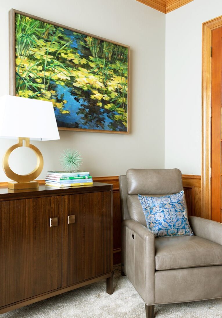
Here are a few examples.
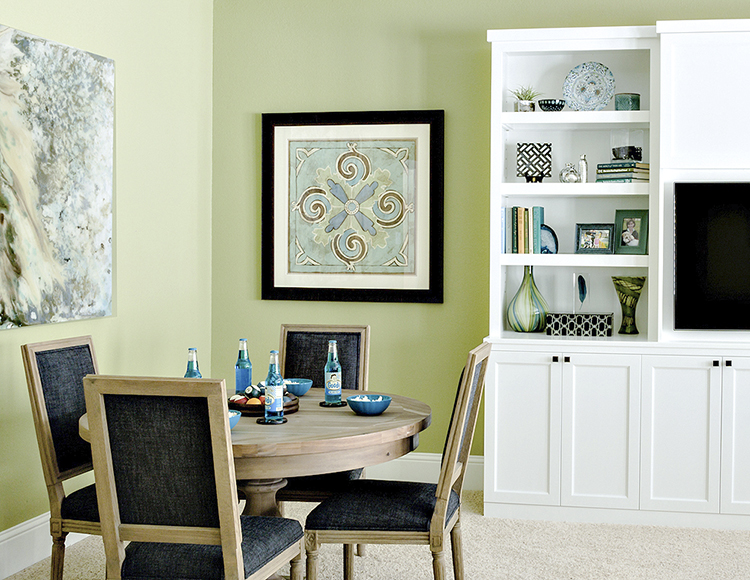
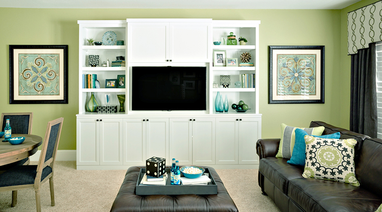
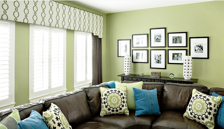
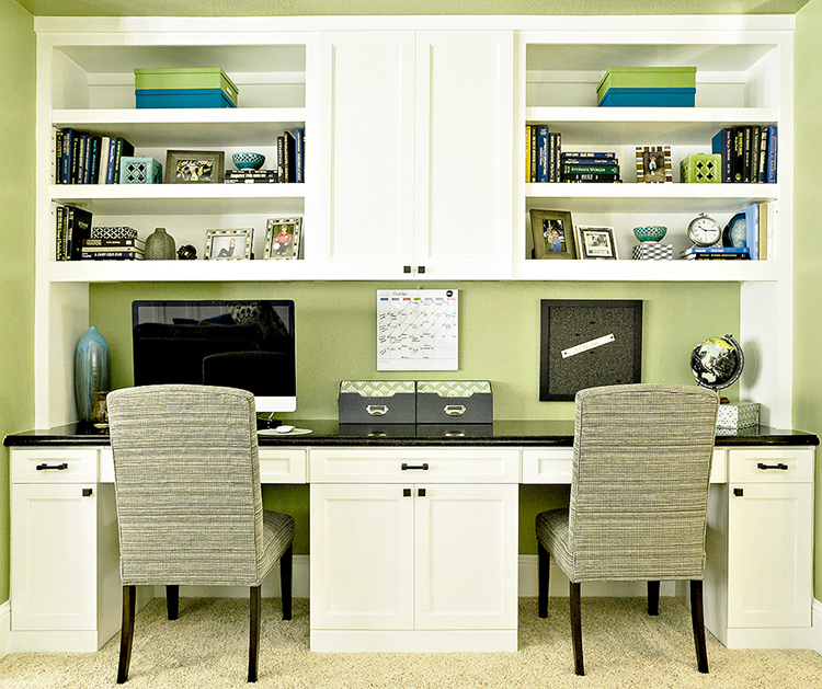
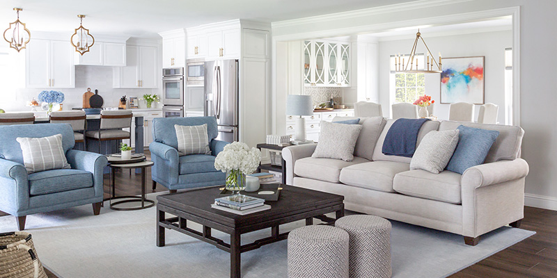
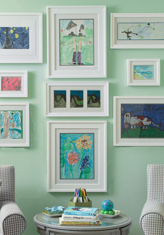
Green is 60% Black is 30% and Blue is 10%. The main color is green note how I did not have as much of it in the artwork. With The TV being black I opted for chairs to have black fabric, framed art too and patterns have black throughout. So here I used blue and green since blue is in green. Black was a great bold contrast and neutral a great balance with bold green and blue I used.
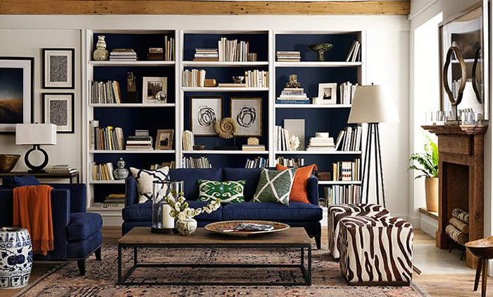
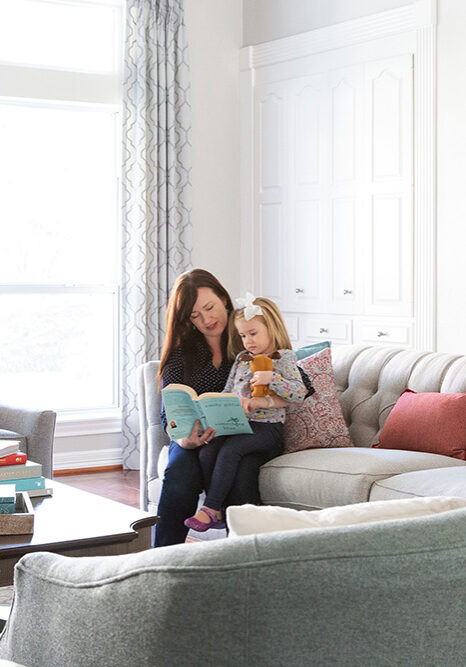
Here is another option. With this room Blue is painted in the bookcases and main furniture piece and mixed with art and accessories (considering it 60%), the brown is more of the secondary color with wood mixes and brown printed ottoman along with accessories (30%), and then accented with two colors orange and green (10%).
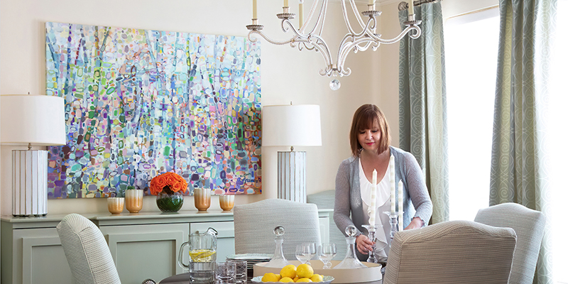
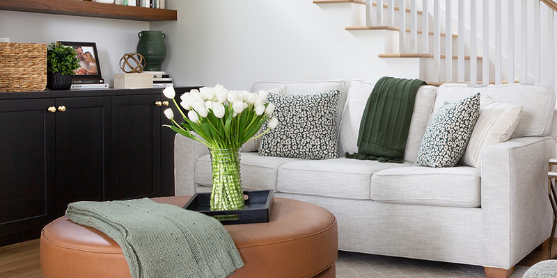
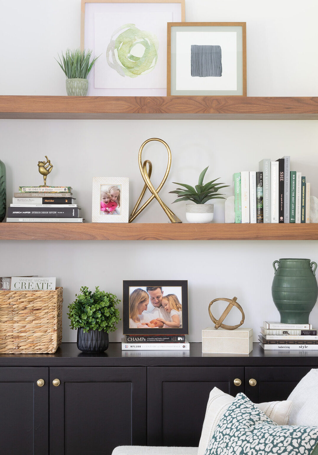
In this example, turquoise is the main color, yellow is secondary and then I pulled a bit grey with the storage bins and black/grey and white prints on the stairs to tie in the floor pattern.
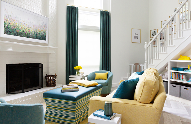
Like I said this does not have to be exact but if you feel your color scheme is missing something, see if you may need to add or replace a color. Accessories are the best way to start including throw pillows, if that still isn’t working look at artwork too. It is a great guide especially if you want to add colors in a more balanced way in your space.
Happy Decorating! Karen
Meet Karen Davis
Marker Girl was inspired by an unforgettable moment with my daughter, a marker, and our furniture. That experience sparked my mission to find stylish, family-friendly furnishings and help others create spaces where life thrives without compromise.
My blog shares the very best of what I have learned about family-friendly design these past 20 years.
Our Interior Design Services cater to your family’s lifestyle.

Get Our Latest Interior Design News In Your Inbox
Save yourself some time and effort, opt-in to my email list. You will receive recaps of the latest tips and advice about designing a family home every month!

