Small Home Gets A Grown Up Family-Friendly Makeover
I am happy to share with you all the details from a project that was just featured in the Houston Chronicle today!
This redesign was for a family of 4 in the Heights. They requested a redesign of their very small home that is under 1500 sqft. The couple has two twin toddlers, so with their small home, organization was a must. I was hired to help them create an Entry, Family Room, and a few other smaller spaces around the home to meet their needs keeping it family-friendly but making it feel like a place they feel at home in as a couple and family.
Their plan is to expand later, once the kids are a little older. For now, they want to start the process of making it a family home they can be happy in and function for a family of 4.
Please see the photo gallery below to see before and after’s of how we were able to achieve their wishes.
Entry
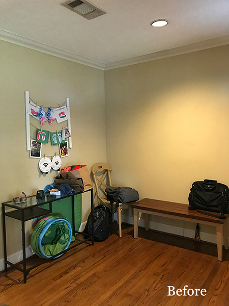
They needed more storage in their small home. Starting with the Entry we needed to come up with a design that housed bags, shoes and everyday items that come into the home.
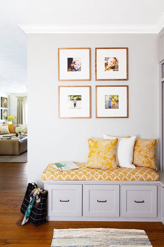
Solution for Entryway was to build custom cubby’s from floor to ceiling and a bench seat, so we could use every inch of the space without affecting the door swinging open into the room. We used the side wall where the door swings open for most of the storage. Then added a softer seating area on the opposing wall from the front door. This solution didn’t make you feel closed off when you walked into their home.
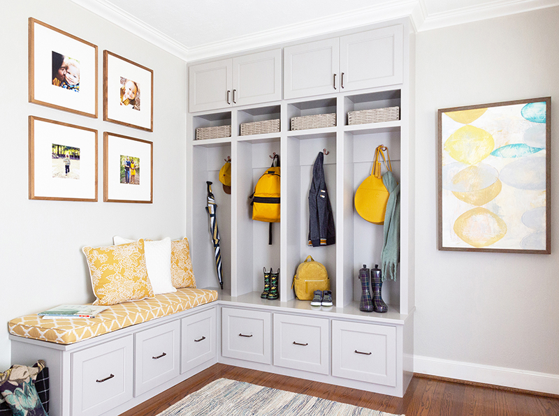
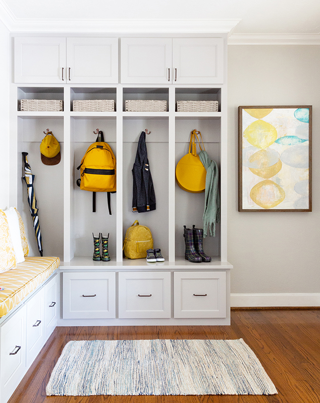
We went with a slightly darker grey (SW Repose Gray) for the cabinetry than the walls (SW Agreeable Gray), to stand up to wear and tear of a young family. We separated the cubbies into 4 sections giving each family member their own cubby areas, also adding hooks in them to hang jackets and bags. All along the bottom are drawers to give them more storage that they needed with their small home.
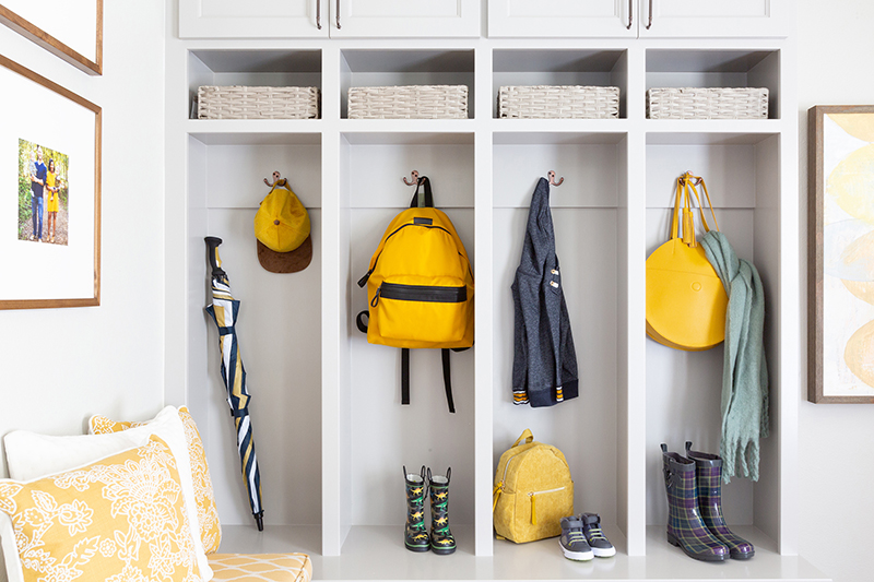
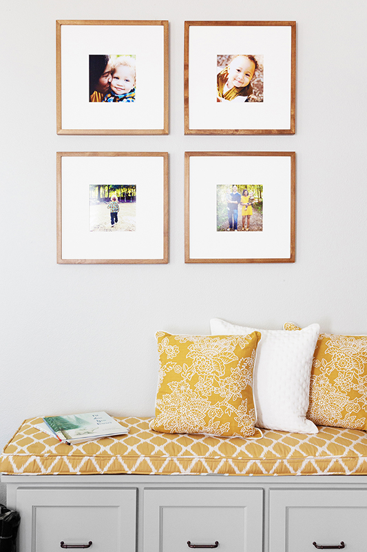
A soft yellow seat cushion and pillows were added to bring out the colors from the family photo gallery. We opted for a family photo gallery to give the space a more personal touch showcasing that this is their family home when you walk in. They come in every day from the front door and now have an organized beautiful entry that makes them feel at home.
Family Room
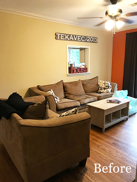
The Family Room lacked a good seating arrangement and felt blocked off. It was hard to walk around to get into the room with the current layout. My clients struggled with creating a more functional layout and wanted a nice simple seating area that looked, what she called “all grown-up” for her and husband to enjoy with their children.
Solution for Family Room was to close in the pass-through that was on the wall to the Kitchen. This gives the room a more open feel. The clients opted to add on a side seat to this sectional, this is so someone could either sit on the end or lay back to watch TV. The sofa section is oversized and can seat their whole family. There really isn’t enough space to add an extra chair to walk around the furniture. The french door has to open on the right side into the room, which limits this area as well.
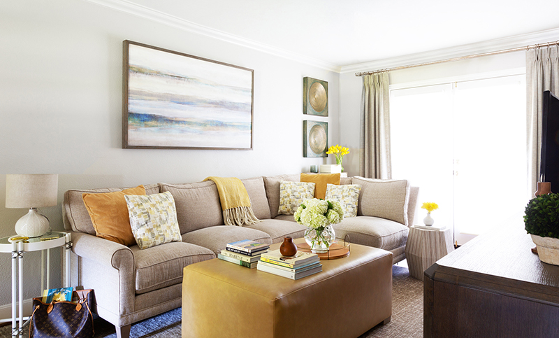
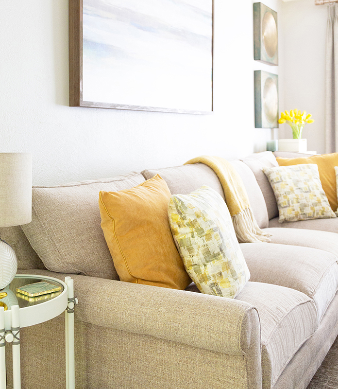
With her having toddlers, I recommended the furniture to have rounded corners so the kids could play. I opted to design a custom vinyl fabric kid-friendly ottoman and used stain resistant fabric for the sectional. I brought in the yellow as accents from the Entry which is right off the open space. A media cabinet is across the sectional to house the TV and adds storage for toys and electronics to be out of sight and touch for the little ones.
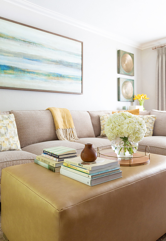
The stationary decorative drapery panels are made of soil resistant fabric, so sticky hands can touch them from time to time. They flank each side of the French doors.
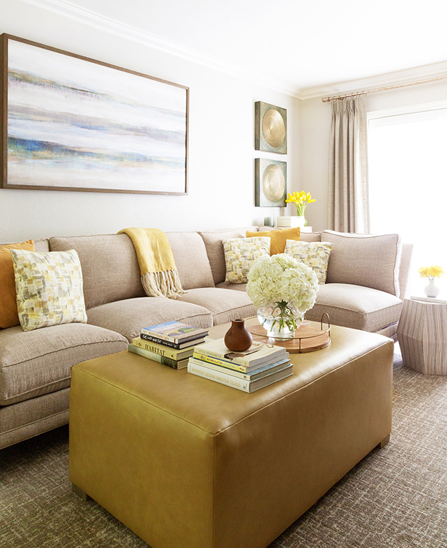
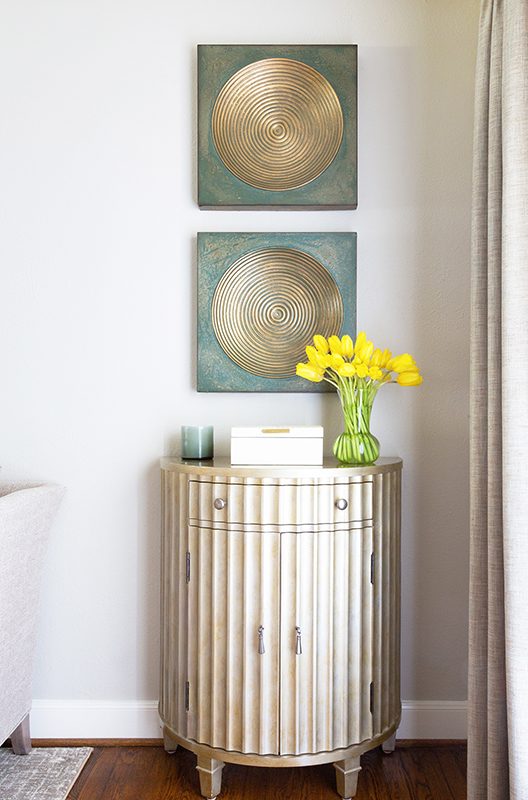
A neutral light grey (agreeable gray) was painted through-out on the walls to open up the room. And a small decorative chest was placed behind the sectional for storage and add a decorative piece that wouldn’t be in way of the door opening from outside. I advised her to not paint an accent wall as she had previously for a room this small because that can make it seem more narrow than it already is at 15’ x 10’ 8”.
Spare Room
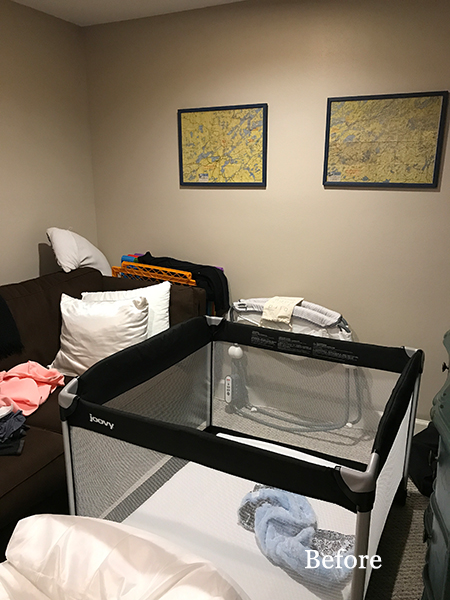
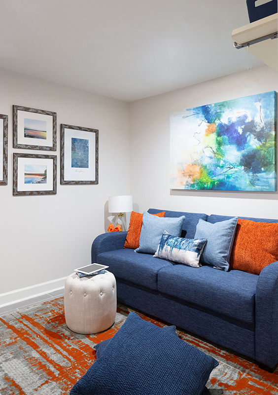
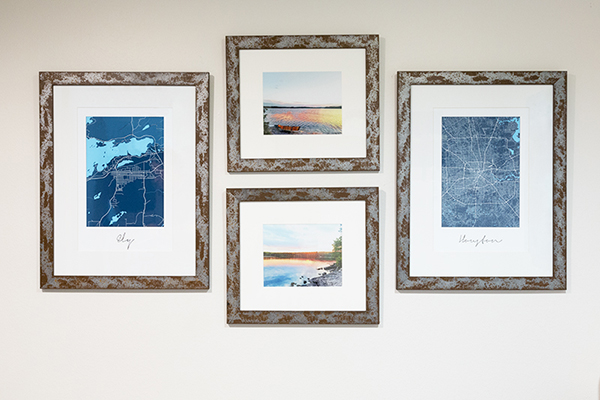
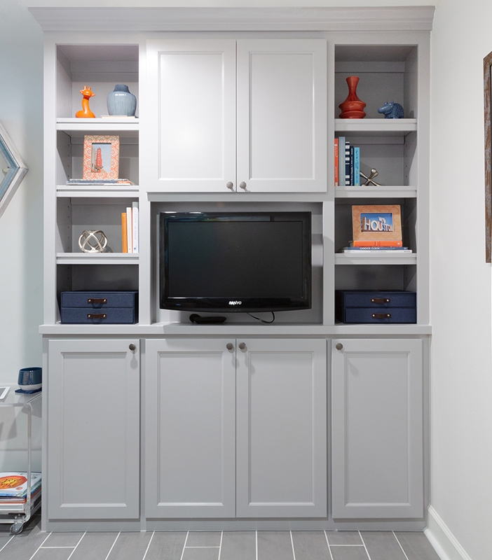
They also had a small garage that was partially closed in for a spare room that was being used store odds and ends. But wanted a nicer space where a guest could sleep but the kids could play in as well. So we placed a sleeper sofa and small built-in only so the kids had room to play in the space. We added photos from where he is from on the wall that I photoshopped to add a more colorful highlight and found these fun custom maps of the two cities where they are both from, and since that is where the guest that come are from as well. All custom framed to give them a rustic meets modern feel. This is a city meets country space. With the TV cabinet, we custom built, added were a couple of photos of the area they now live in, Houston, and closed storage for the kid’s toys.
Kitchen
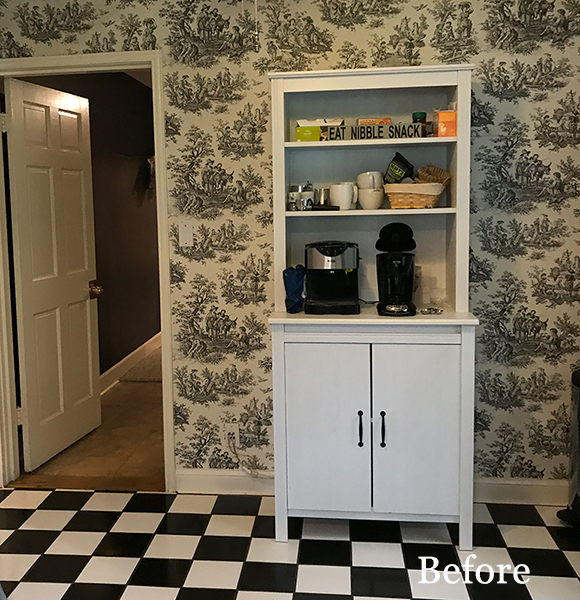
Since they are waiting on the Kitchen to be remodeled, my client really wanted a nicer coffee bar. We took down the wall-paper that they inherited from the previous owner that she really wanted down, and created this nice little coffee area for her. We also added a wine rack in the Kitchen where we closed off the pass-through.
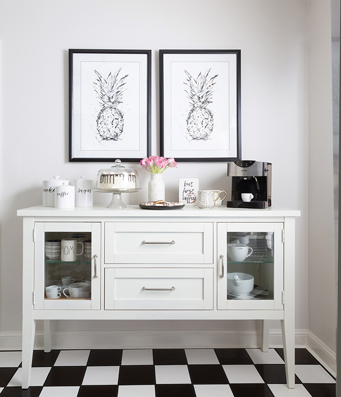
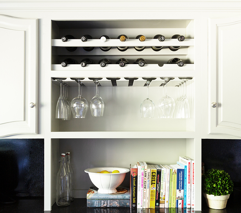
This was a fun redesign that the whole family enjoys.
Kind words from my client:
Working with Marker Girl was better than I could’ve imagined. I hit it off immediately with Karen, and she was able to bring my vision to life. As a working mom of 2 young kids, it was very important that everything we had was functional (and easy to clean!) but still aesthetically pleasing. Karen knocked it out of the park. She’s so easy to work with, very responsive, and just a great person overall. I can’t recommend her enough.
– April | Houston, TX
We would love to work with you on your next project. Check out all of our services here.
While we don’t share the full list of links from our custom design projects (since that is what our clients pay us for and are trade sources, mainly custom made) here is how you can achieve a similar look: Check out our shop for more finds.
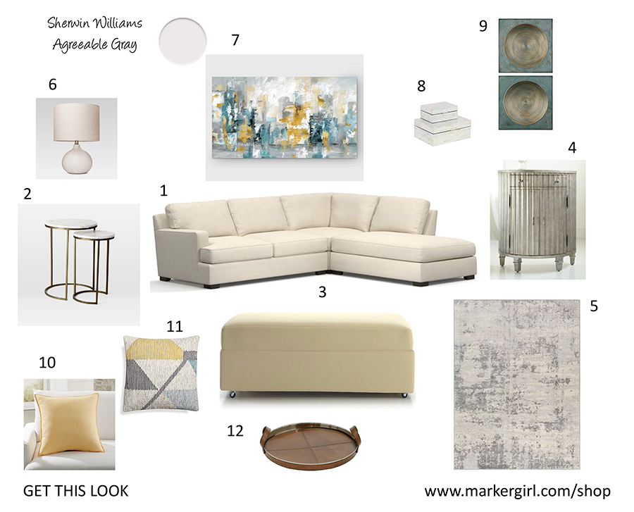
1 Pottery Barn / 2 West Elm / 3 Crate and Barrel/ 4 Horchow / 5 Wayfair
6 Target / 7 Wayfair / 8 Overstock / 9 Overstock /10 Crate and Barrel
11 Crate and Barrel / 12 Target
Happy Everything! Karen
1 Comments
Leave a Comment
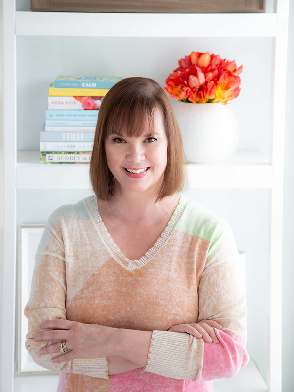
Meet Karen Davis
Marker Girl was inspired by an unforgettable moment with my daughter, a marker, and our furniture. That experience sparked my mission to find stylish, family-friendly furnishings and help others create spaces where life thrives without compromise.
My blog shares the very best of what I have learned about family-friendly design these past 20 years.
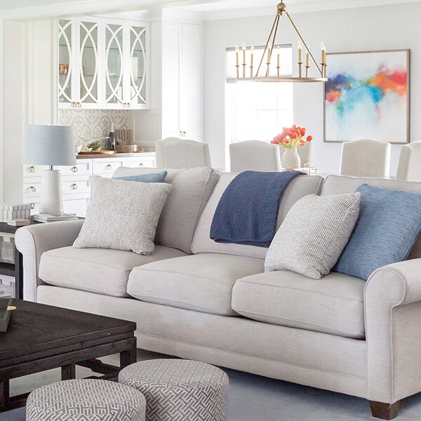
Our Interior Design Services cater to your family’s lifestyle.

Get Our Latest Interior Design News In Your Inbox
Save yourself some time and effort, opt-in to my email list. You will receive recaps of the latest tips and advice about designing a family home every month!

Great transformation, thank you for sharing. I love everything!